Hannah Recht
Data journalist
I’m a data reporter who investigates how the decisions made by people in power affect our lives using statistical analysis, graphics, and traditional reporting techniques. I’m dedicated to open data: whenever possible, I share analysis, cleaned data, and code with local reporters and the public using Github and easy-to-use spreadsheets.
As an R programmer, I built censusapi, an open-source package that makes it easy to grab U.S. Census Bureau data programmatically. I’ve spent years diving into the weeds of Census data and bring that experience to my reporting on on geospatial patterns, demographic trends, and disparities.
I reported on the U.S. health care system at KFF Health News, where I covered the systematic defunding of our public health system, violations of disability rights laws, and disparities in the rollout of covid treatments and vaccines. Before that, I worked at Bloomberg News as a data and graphics reporter and at the Urban Institute as a data analyst and data visualization developer. I graduated from the University of Rochester with a degree in mathematics and statistics and a minor in epidemiology.

Projects
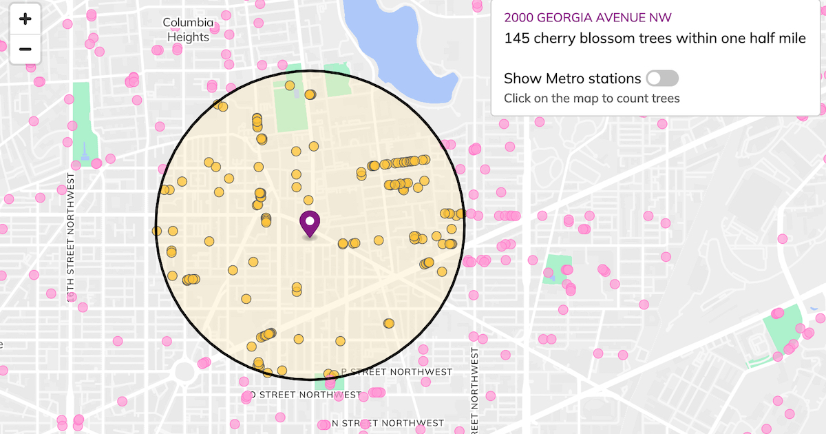
Counting Peak Bloom
The beauty of D.C.’s cherry blossoms isn’t in the festival, the parade or the hordes of tourists who descend upon the National Mall. I mapped cherry blossom trees across the District to count how many are near any address. Click on your home to find how many you can reach in a half mile radius, or about a ten minute walk.
I built this project with 100% open-source software including MapLibre, Turf, Protomaps, and the D.C. address API.
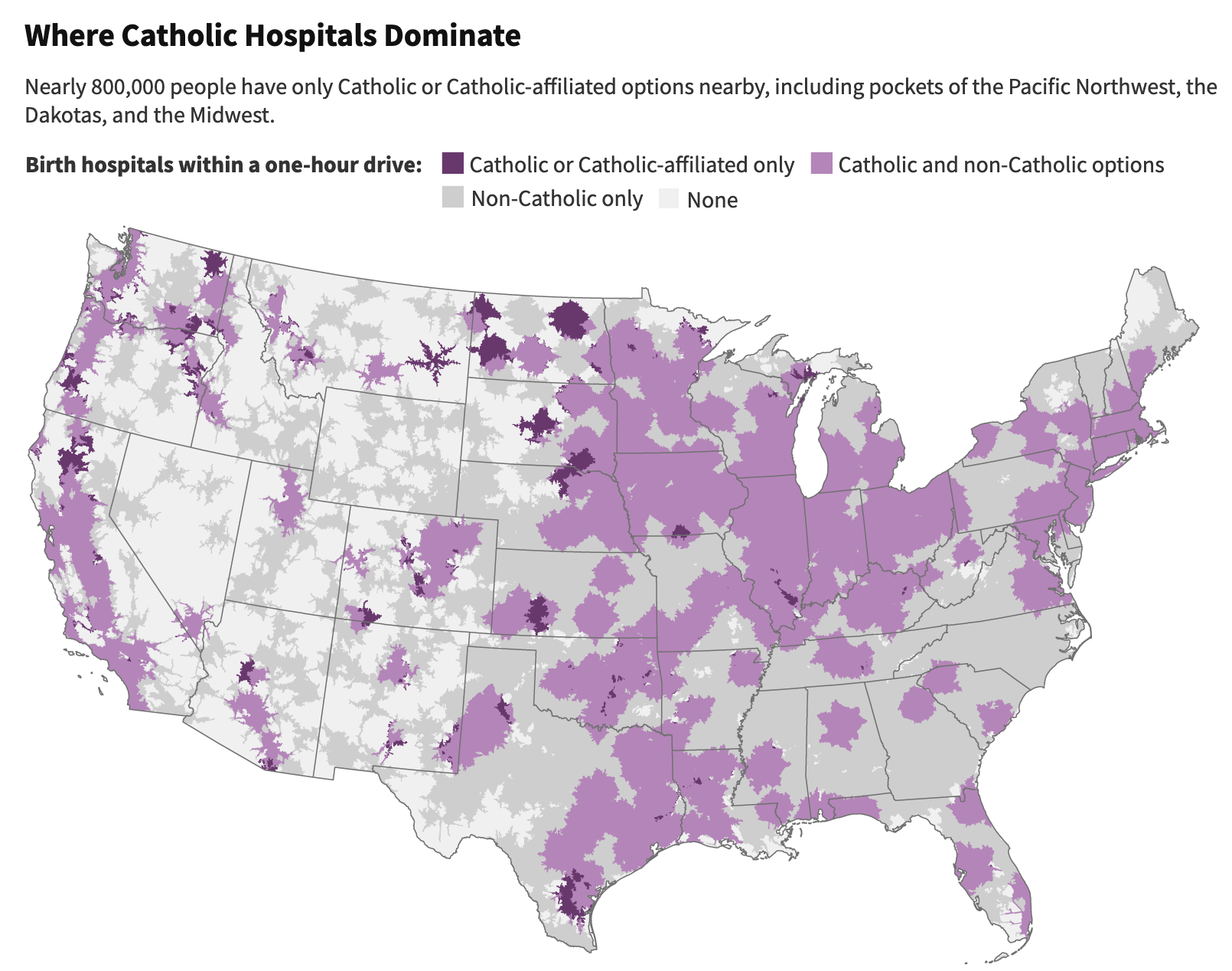
The Powerful Constraints on Medical Care in Catholic Hospitals Across America
I compiled detailed birth data from every state and tracked the affiliation of every hospital in the U.S. to find that 16% of births are in Catholic hospitals, which restrict reproductive and contraceptive care. My spatial analysis revealed that three out of four Americans live within an hour's drive of Catholic birthing hospitals.
Our investigation found that many don’t have a choice for their care — non-Catholic hospitals are too far to reach in an emergency or aren’t in their insurance networks. Ambulances may take patients to a Catholic facility without giving them a say. Women often don’t know that hospitals are affiliated with the Catholic Church or that they restrict reproductive care.
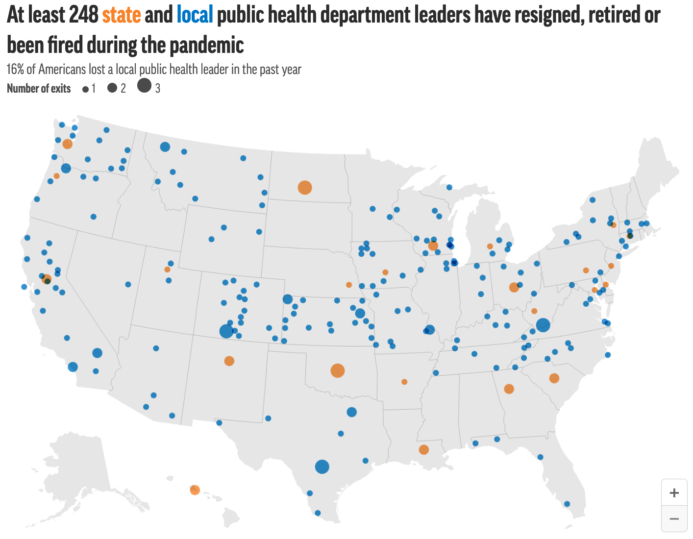
Underfunded and Under Threat
This year-long project examined how the U.S. public health front lines have been left understaffed and ill-prepared to save us from the coronavirus pandemic.
- Politics Slows Flow of US Pandemic Relief Funds to Public Health Agencies
- Florida’s Cautionary Tale: How Gutting and Muzzling Public Health Fueled COVID Fire
- Pandemic Backlash Jeopardizes Public Health Powers, Leaders
- Public Health Experts Worry About Boom-Bust Cycle of Support
Winner of the 2021 Online Journalism Awards University of Florida Award for Investigative Data Journalism and the 2020 AAAS Kavli award, science reporting. Finalist for the 2021 NIHCM award, general circulation and 2020 SABEW award, government.
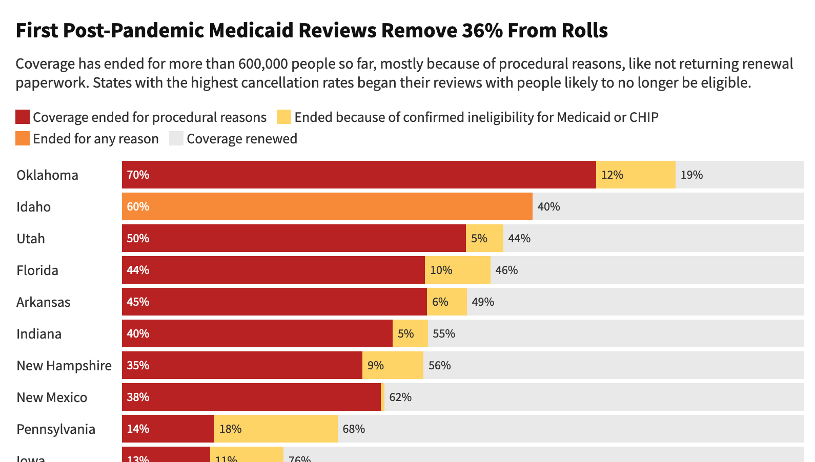
As Medicaid Purge Begins, ‘Staggering Numbers’ of Americans Lose Coverage
In the early days of the Medicaid “unwinding”, I requested data from every state that had begun to roll back pandemic-era Medicaid eligbility protections. My analysis found that the overwhelming majority of people who had lost coverage so far were dropped because of technicalities, not because officials determined they are no longer eligible.
I published all of the underlying records for reuse by local reporters and researchers.
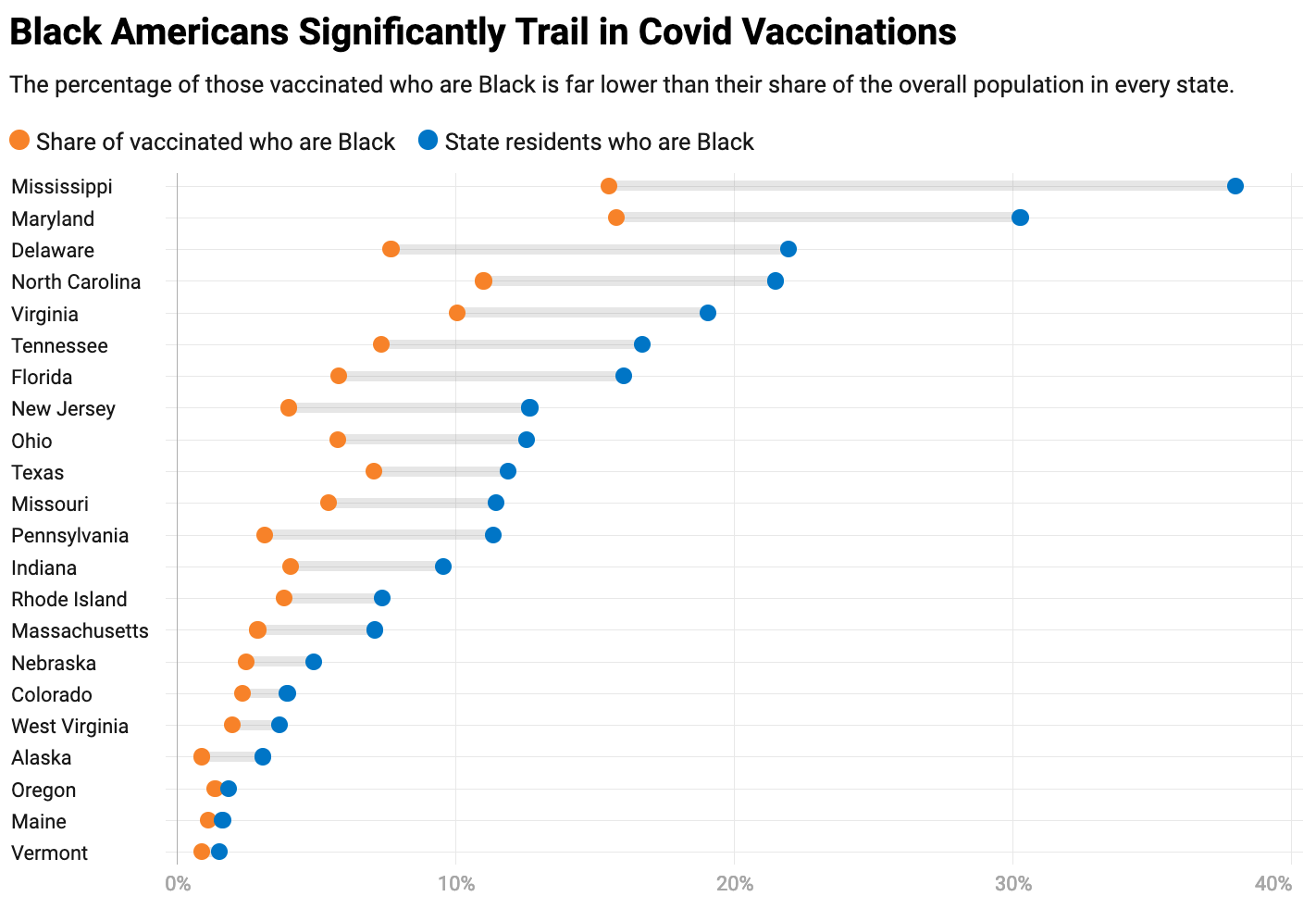
Covid Vaccination Disparities
We published one of the first national analyses revealing deep racial disparities in the covid vaccine rollout. We later obtained exclusive federal data on vaccinations by race and ethnicity for every state and also analyzed vaccination rates of children.
- As Vaccine Rollout Expands, Black Americans Still Left Behind
- Stark Racial Disparities Persist in Vaccinations, State-Level CDC Data Shows
- As Omicron Surges, Effort to Vaccinate Young Children Stalls
Finalist for the 2022 NIHCM award, general circulation.
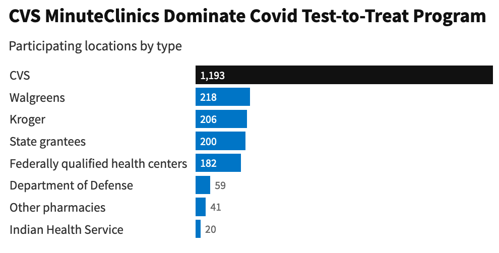
Covid Treatment Rollout
I investigated how well the US’s covid treatment strategy served the most vulnerable patients and explained how HHS’s lack of transparency made it difficult for people to get potentially-lifesaving medication.
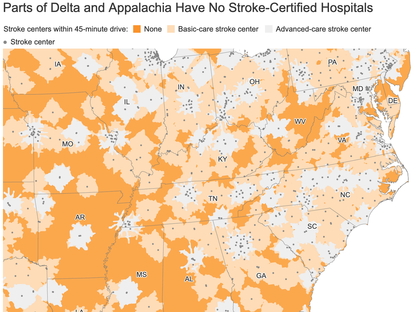
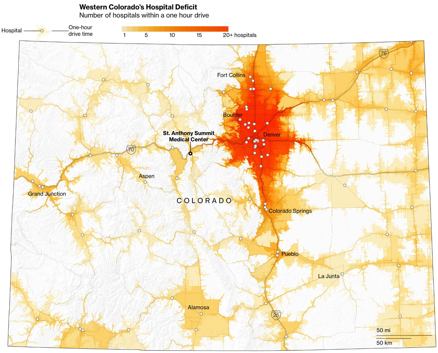
In Appalachia and the Mississippi Delta, Millions Face Long Drives to Stroke Care
In several Mississippi Delta and Appalachian states, more than half of residents must drive longer than 45 minutes to reach a hospital that is stroke-certified and able to provide the most advanced care.
I analyzed drive times to stroke-certified hospitals using R — see the code behind this analysis on Github.
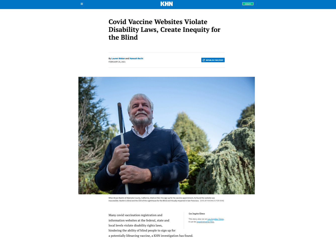
Inaccessible Health Care
Our investigation found covid vaccine registration and information websites at the federal, state and local levels were flouting disability rights laws and limiting the ability of people who are blind or visually impaired to sign up for shots. Five New York state and local government agencies agreed to fix covid-19 vaccine websites to make them accessible for blind users following a Department of Justice investigation spurred by our initial story.
- NY Reaches Agreement With DOJ Over Vaccine Access for Blind People
- The Disability Tax: Medical Bills Remain Inaccessible for Many Blind Americans
Winner of the 2023 Great Plains Journalism Award for General News, Single Story.
What Life Would Look Like Without the ‘Tampon Tax’
“Band-aids—check. Condoms—check. Sunscreen—check. Tampons? Nope, sorry.”
I explored how the omission of menstrual products from the U.S.’s list of medical products eligible for tax breaks disproportionately affected low-income women and girls.
Winner of the 2019 Malofiej Award for Equality and Women’s Promotion Best Graphic, Digital.

Colorado’s Ski Towns Could Fix the High Cost of American Health Care
We examined the high prices and long drives to hospitals that led rural Coloradans to create an innovative insurance pricing model.
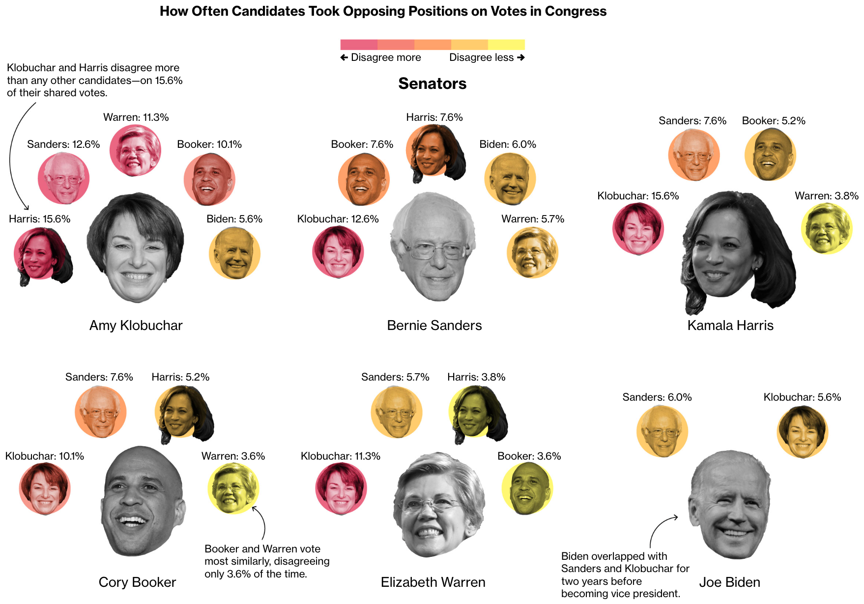
Where Democratic Candidates Disagree in Congress—If They Vote at All
Ahead of the 2020 Democratic primary, I analyzed the Congressional voting record of every candidate to see how often they disagreed with each other.
Orphan Black: Clone Tracker
Orphan Black was a science fiction show about clones starring Tatiana Maslany opposite herself in several lead roles. Some reviewers claimed she must be in every minute of the show. I had to investigate.
In the end, there were 50 episodes and 2,062 minutes of Orphan Black, featuring 1,982 minutes of Maslany.
Here’s How Affordable Care Act Marketplaces Are Shaping Up Under Trump’s Watch
As Republicans attempted to repeal the Affordable Care Act in 2017, health insurance companies began to retreat from the ACA marketplaces. I tracked the proposed 2018 ACA marketplace offerings of every company in every county for several months by analyzing arcane insurance rate filings in this blog-style project.
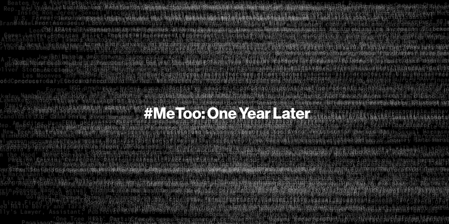
#MeToo’s First Year Ends With More Than 425 Accused
We assembled a database of hundreds of people publicly accused of sexual misconduct in the first year after accusations against Harvey Weinstein became public. For the page header, I created a dizzying animation of the year’s worth of headlines to reflect the quickly growing #MeToo movement.
The Massive Prize Luring Miners to the Stars
Asteroids hold potential riches — if miners can reach them. I created illustrations of the first U.S. spacecraft set to bring an asteroid sample back to Earth and analyzed the estimated quintillions of dollars hidden in some distant asteroids.

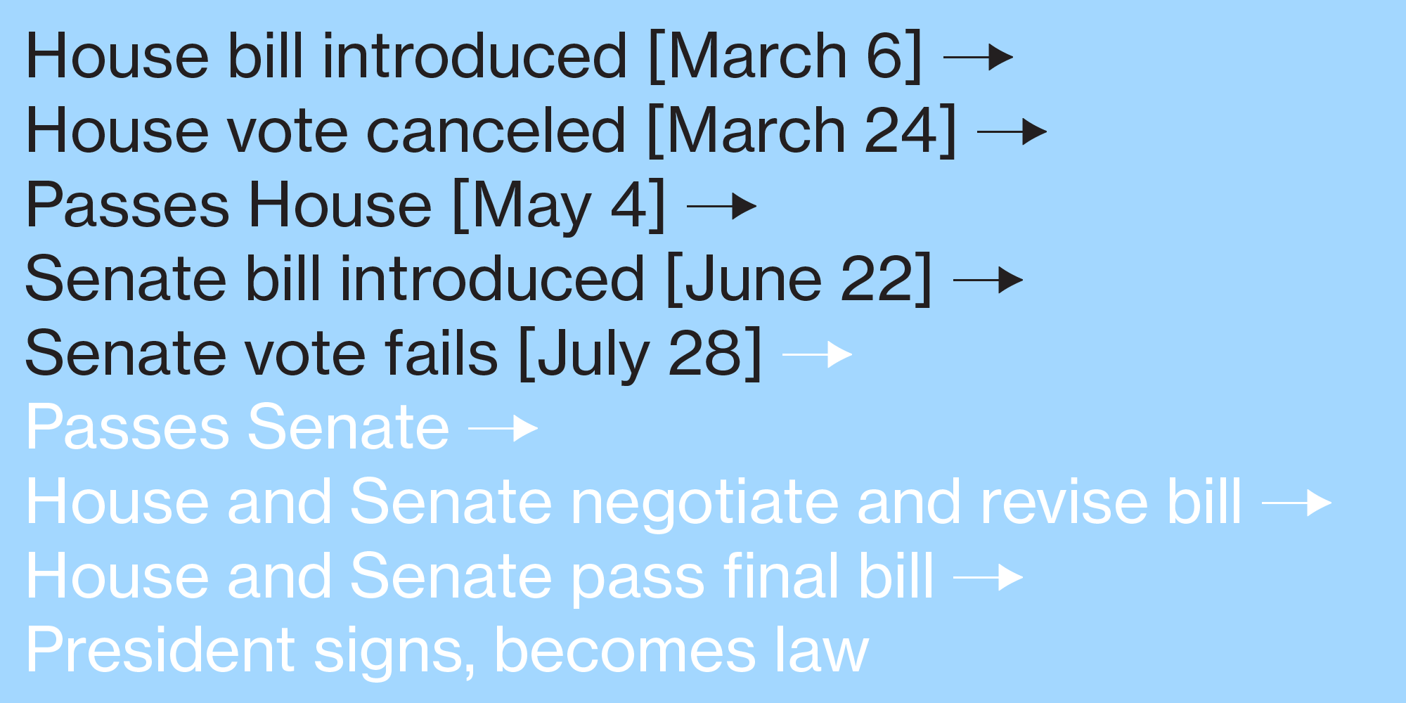
Track the Key Changes in the GOP’s Health Plan
We tracked the many Republican attempts to repeal the Affordable Care Act throughout 2017, quickly analyzing what each new plan would change and how that would impact Americans.
Software
Selected Talks and Tutorials
Icons by Icons8.